Kota
Kota is an employee benefits broker combining insurance expertise with technology to manage health cover, pensions and other benefits. It supports employers from startups making their first retirement contribution to enterprises running programmes across multiple providers. The business had outgrown its early identity, and a crowded website made the offering harder to understand. The brand needed to carry the confidence of the people behind it.
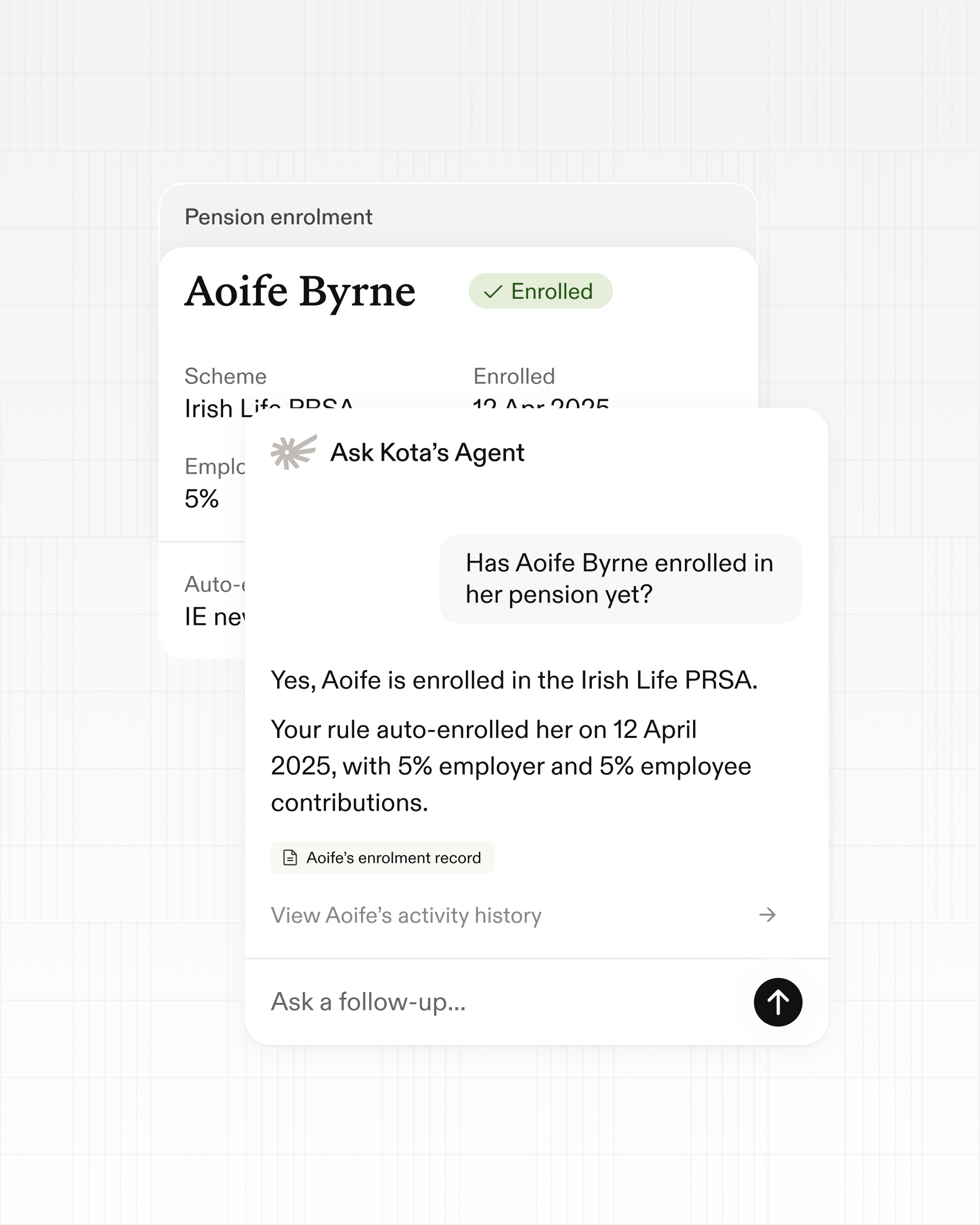
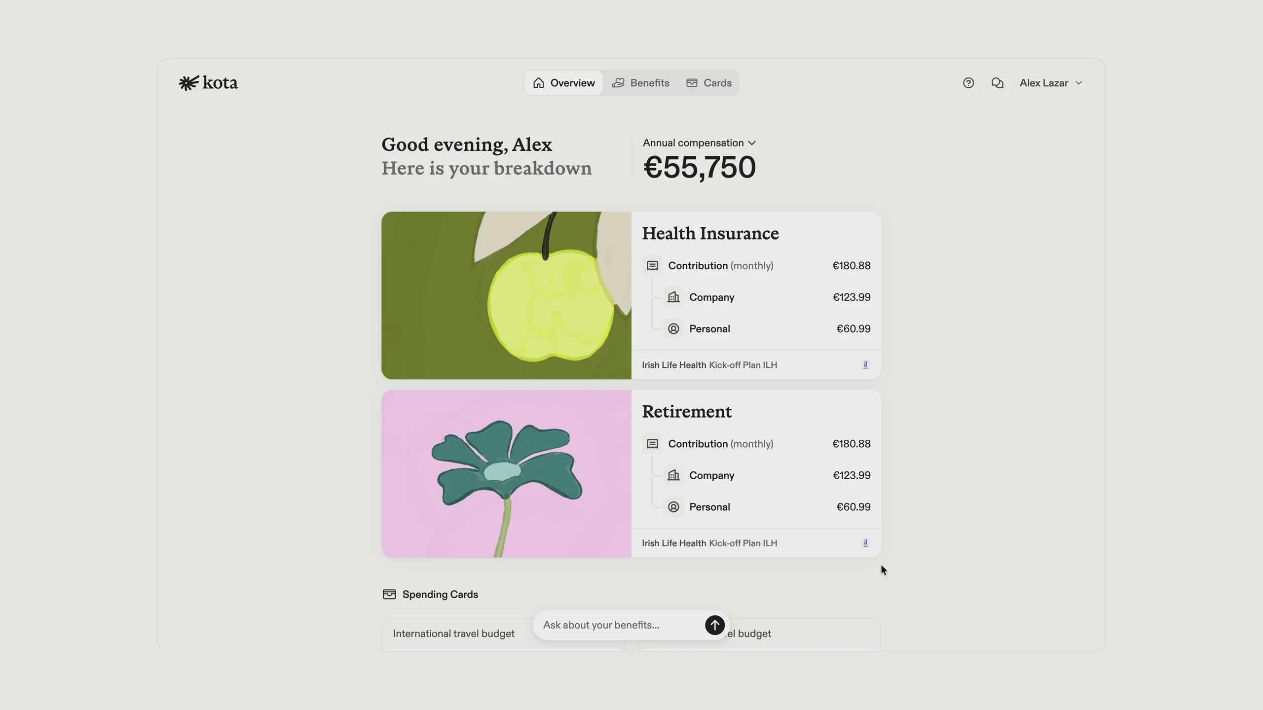
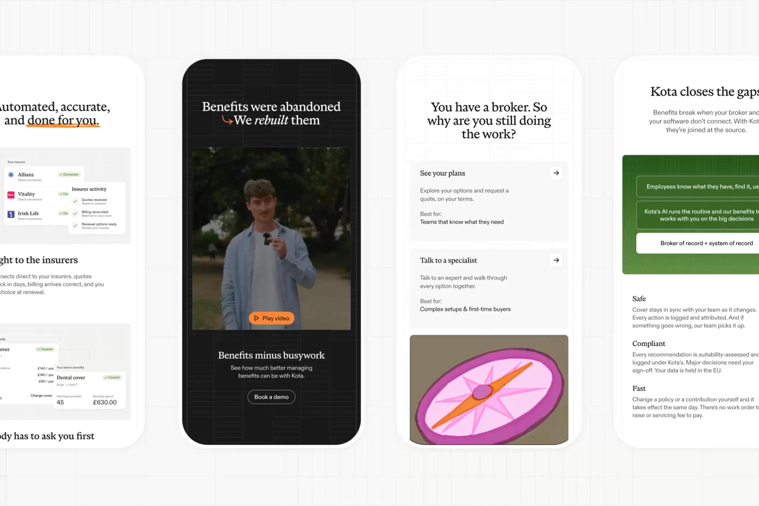
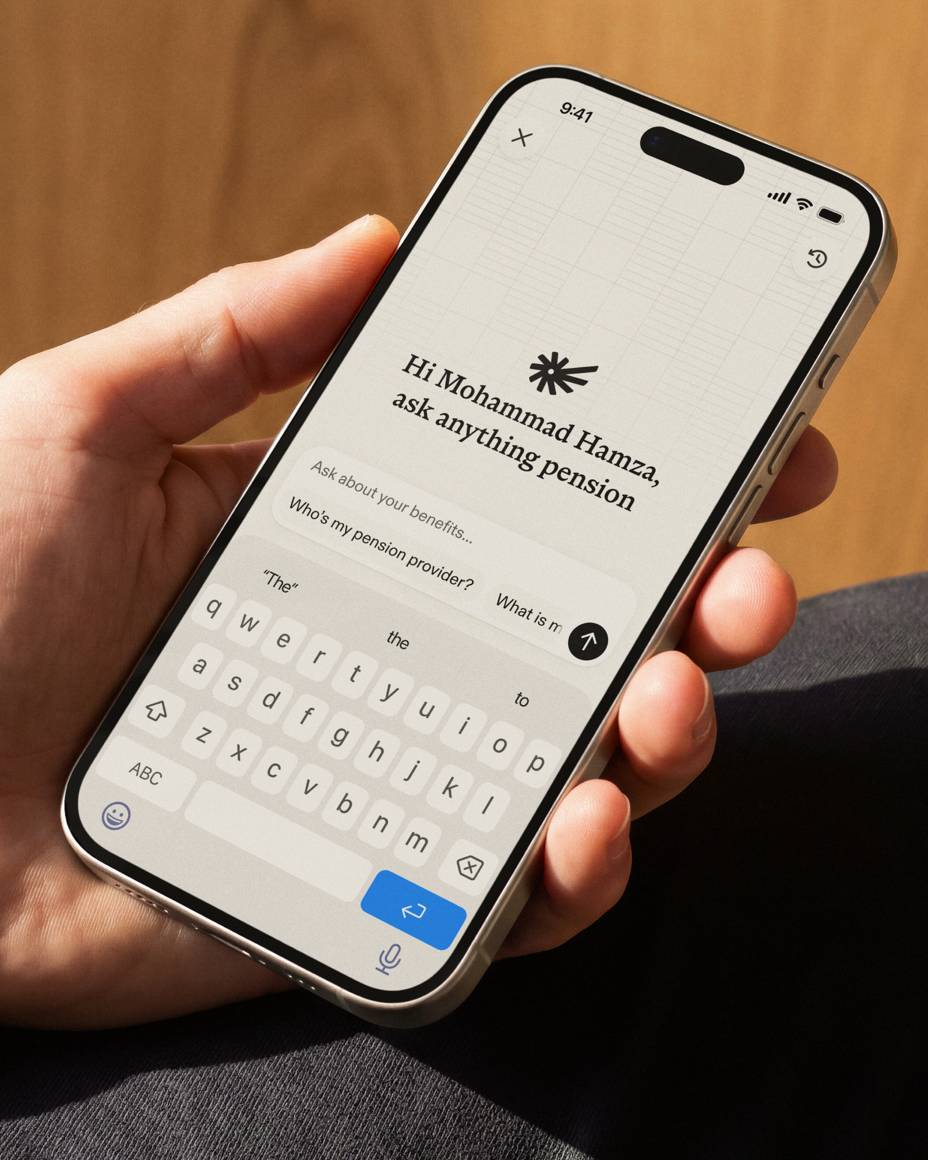
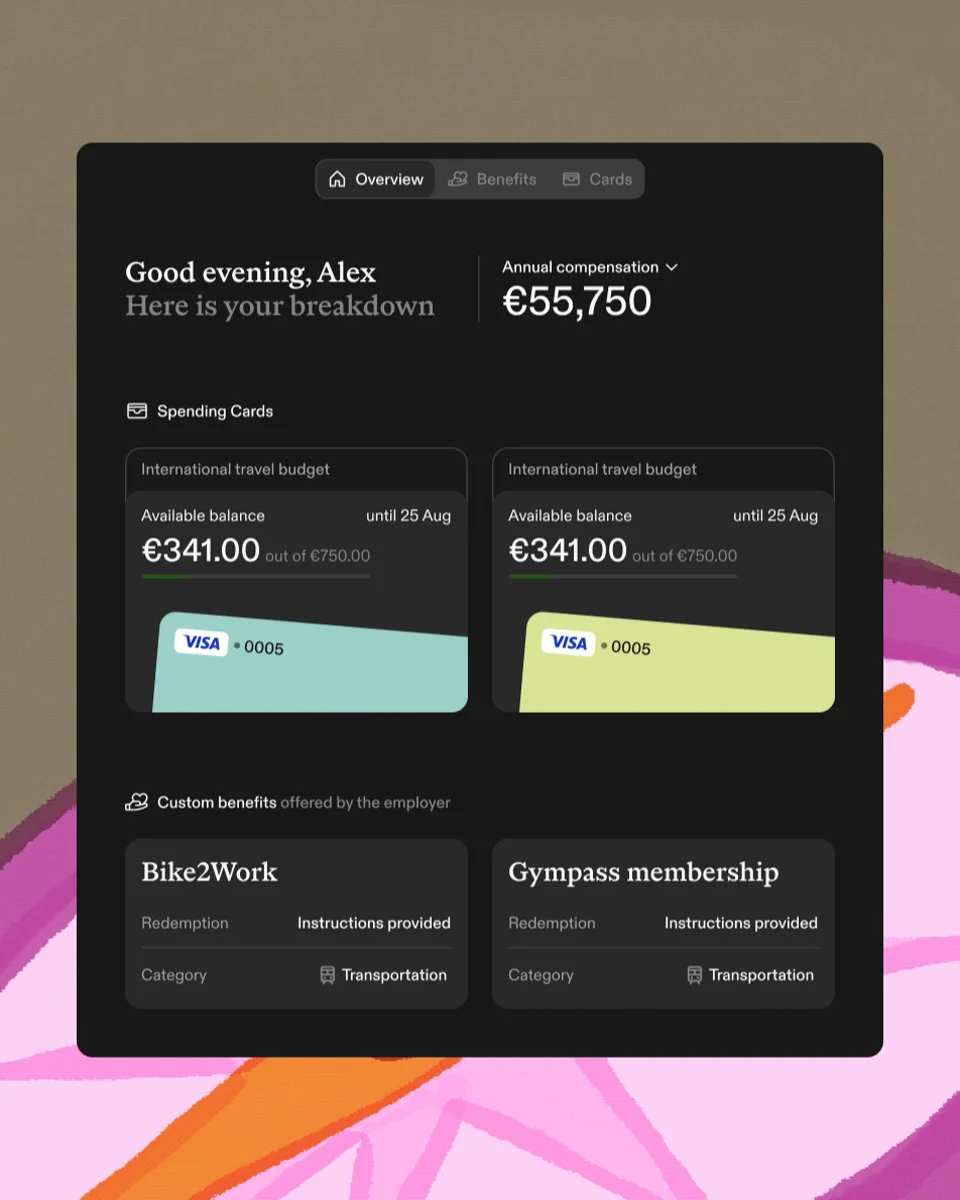
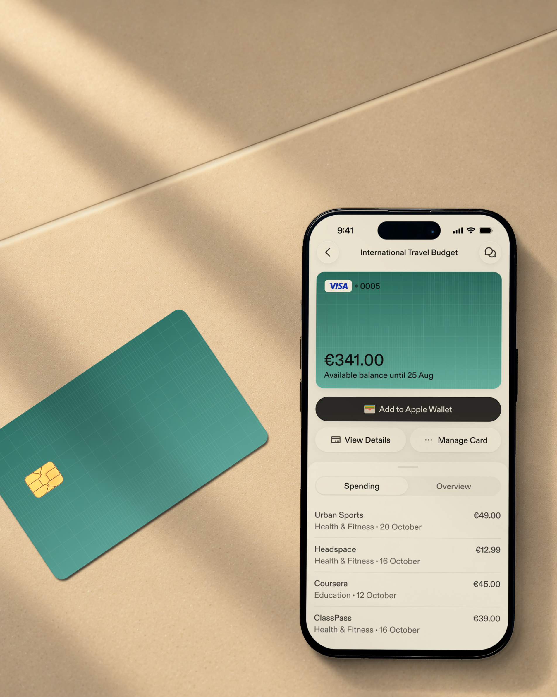
We built the identity around that combination of expertise and personal support. Serif typography gave it authority, with a warmer voice than the conventions of corporate insurance. On the website, we simplified product visuals to explain the relationship between the employer’s tools and the employee’s app. Each view had a job: show how the service works without making the reader decipher a dashboard.
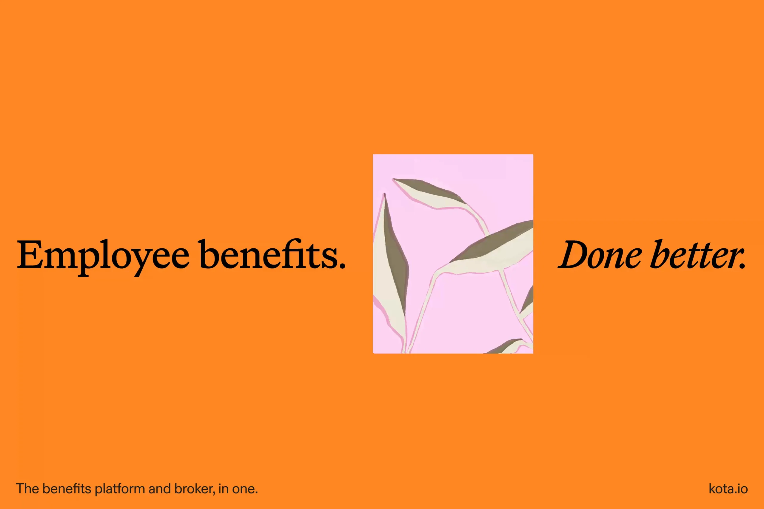



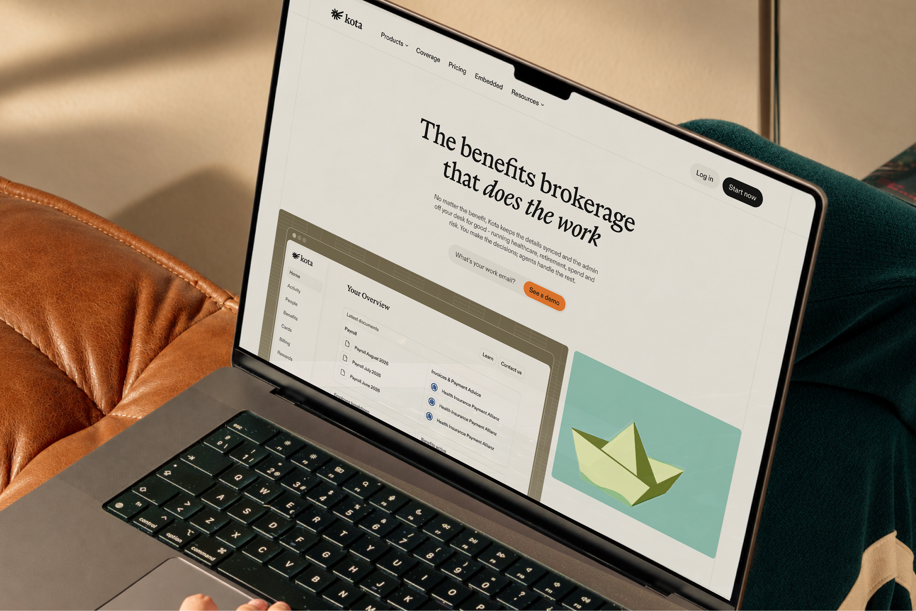
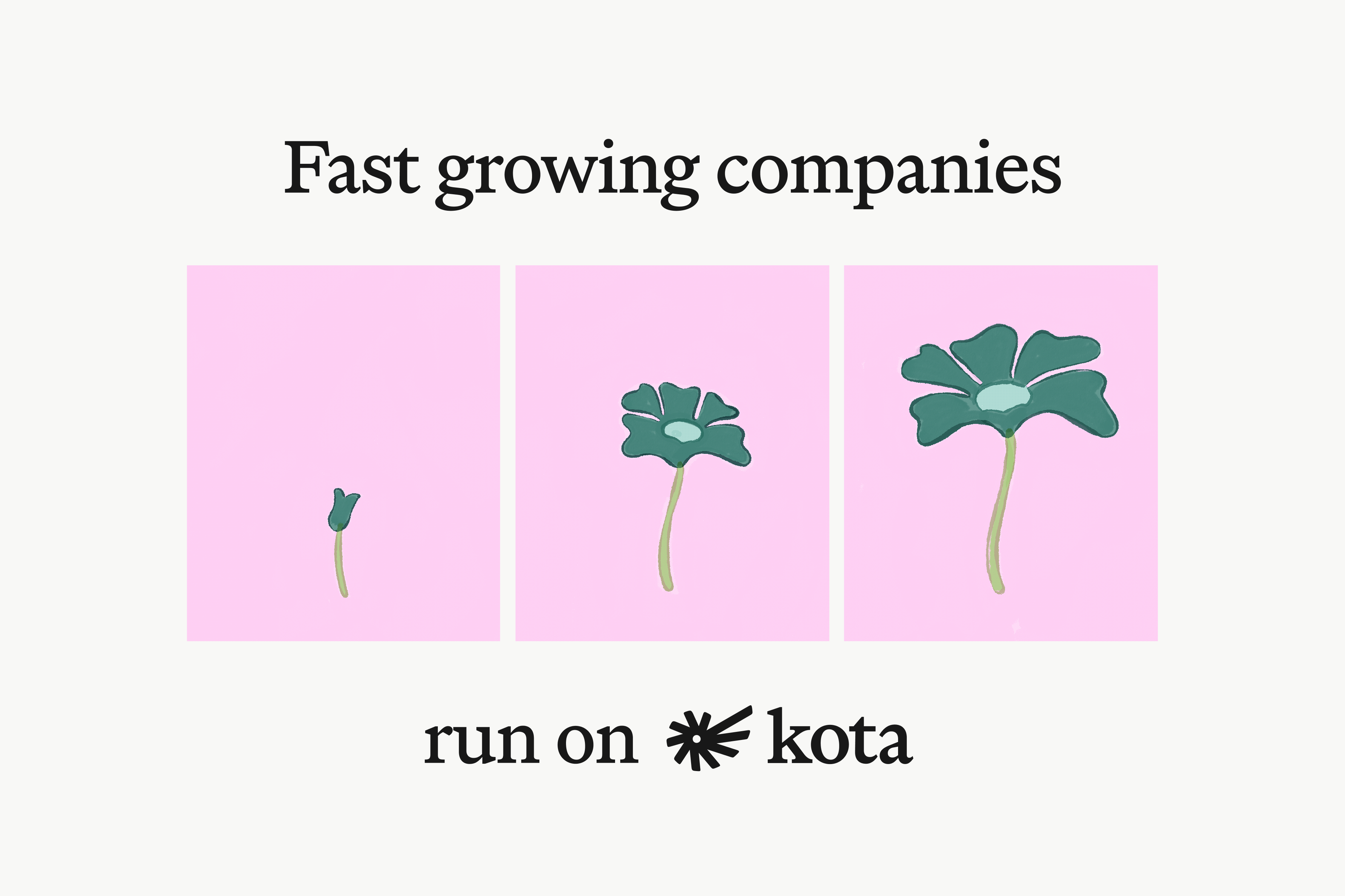
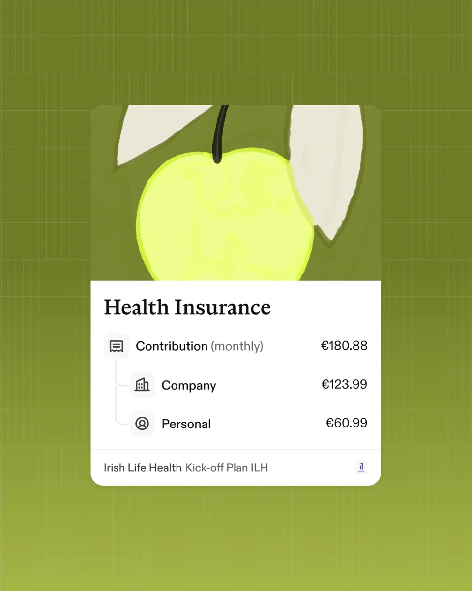
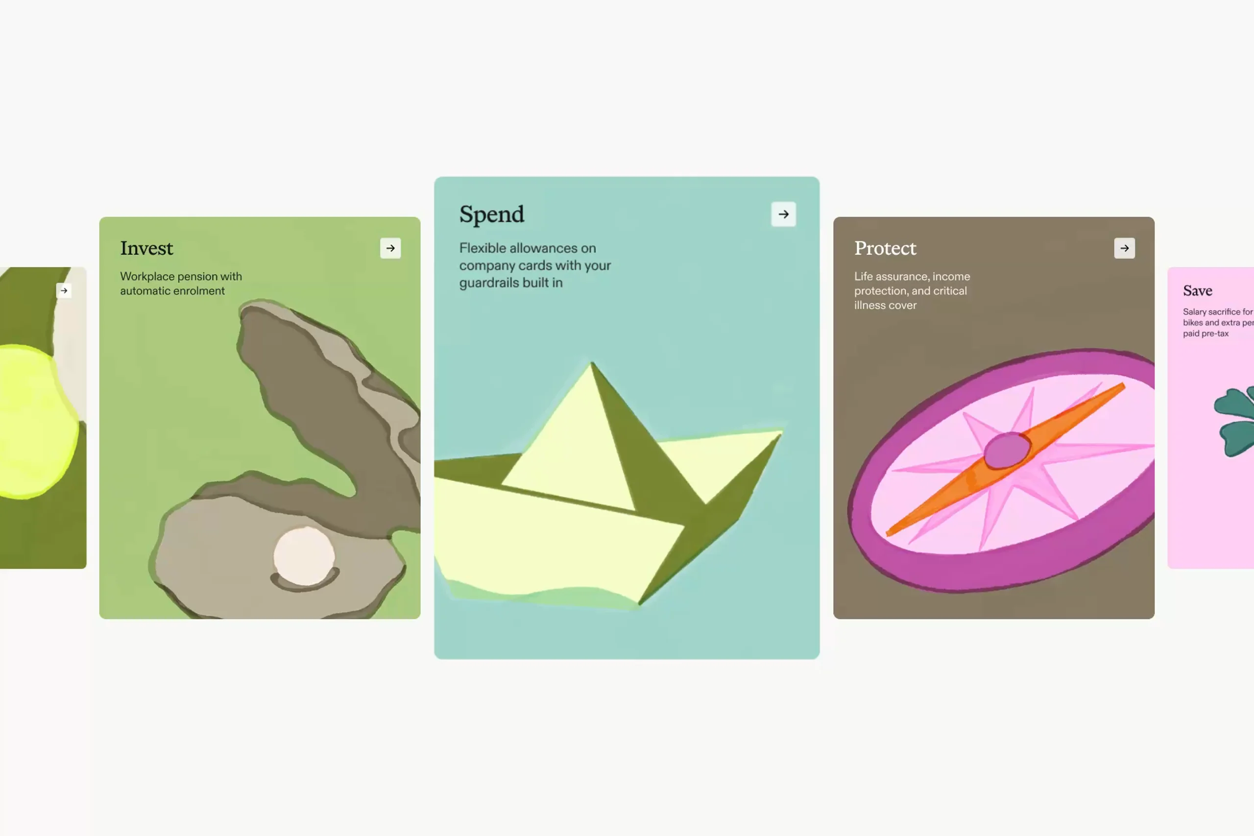



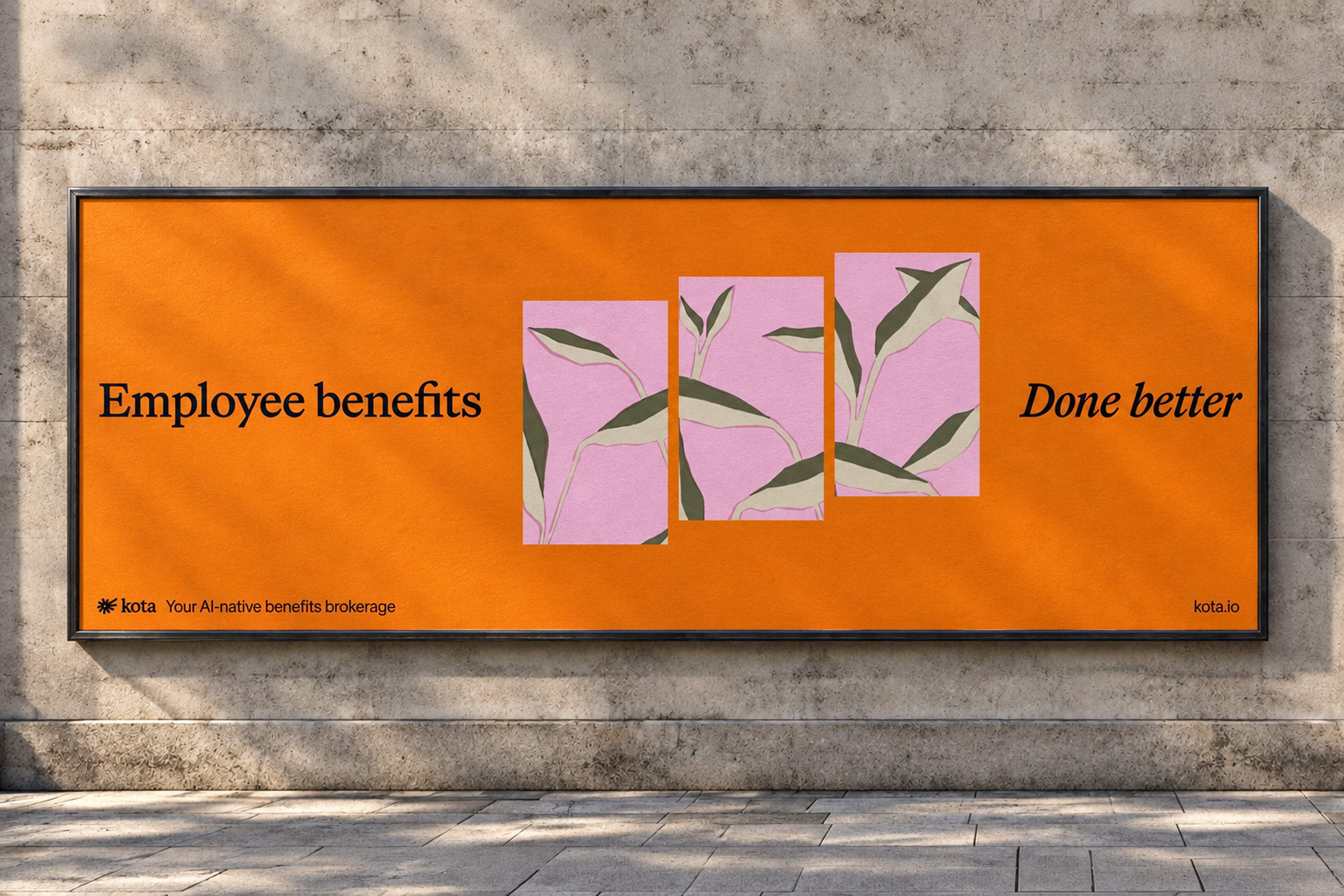
The illustrations bring a different part of the story into focus. Benefits concern people’s health, security, and future, which gave us a richer starting point than familiar insurance symbols. Plants, landscapes, and organic movement became a way to talk about growth and finding your way. Built as animations, spot illustrations, and stills, the artwork gives Kota’s team material to use across the website and everyday communications.
Illustrations by Killian Fallon.