Theo

Three years ago, a Berlin startup called hallo theo said hello to a broken industry: property management. Today they manage 20,000 homes in five cities across Germany. The company needed a brand that matches the momentum.

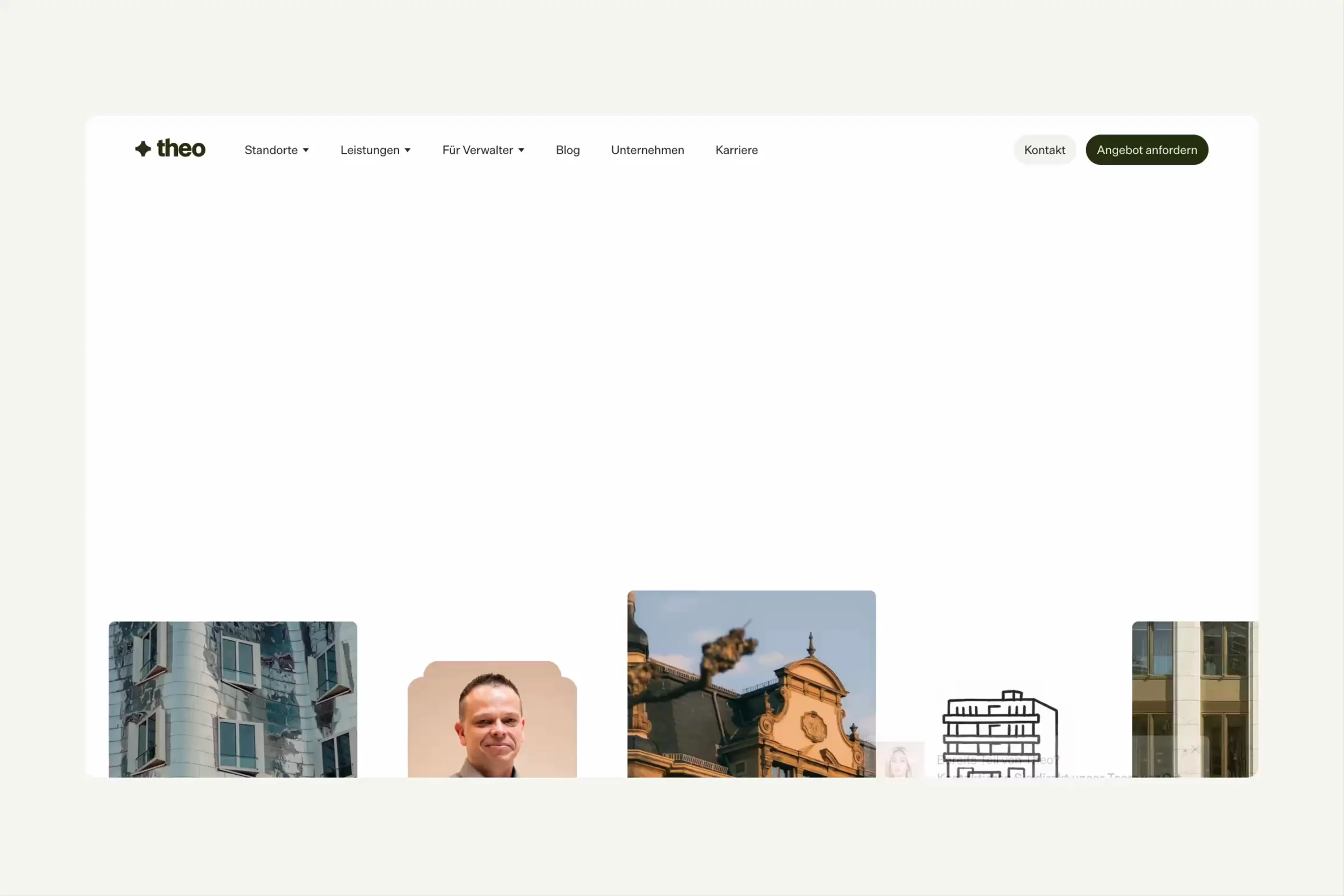
So we rebuilt it from the ground up. New name, new logo, new design language, new website. hallo theo became Theo: shorter, surer of itself, and ready for further growth.
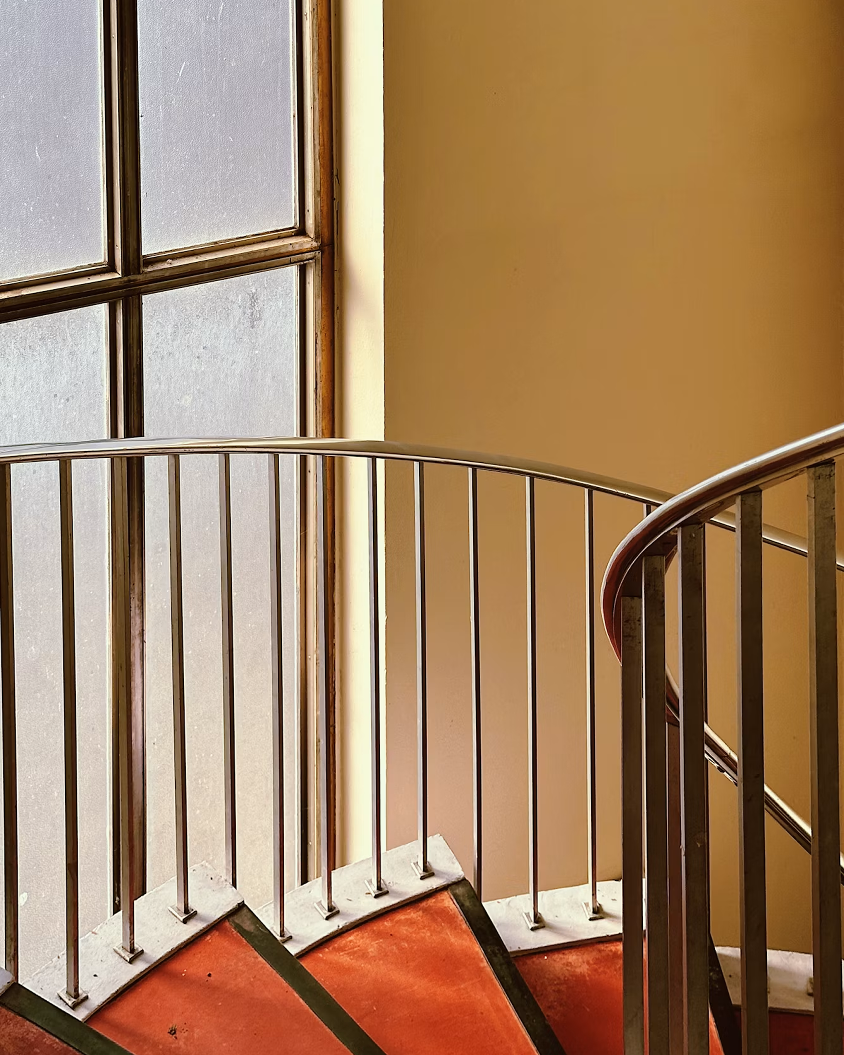
Curved indoor staircase with metal railings, red steps, warm beige walls, and tall frosted windows.
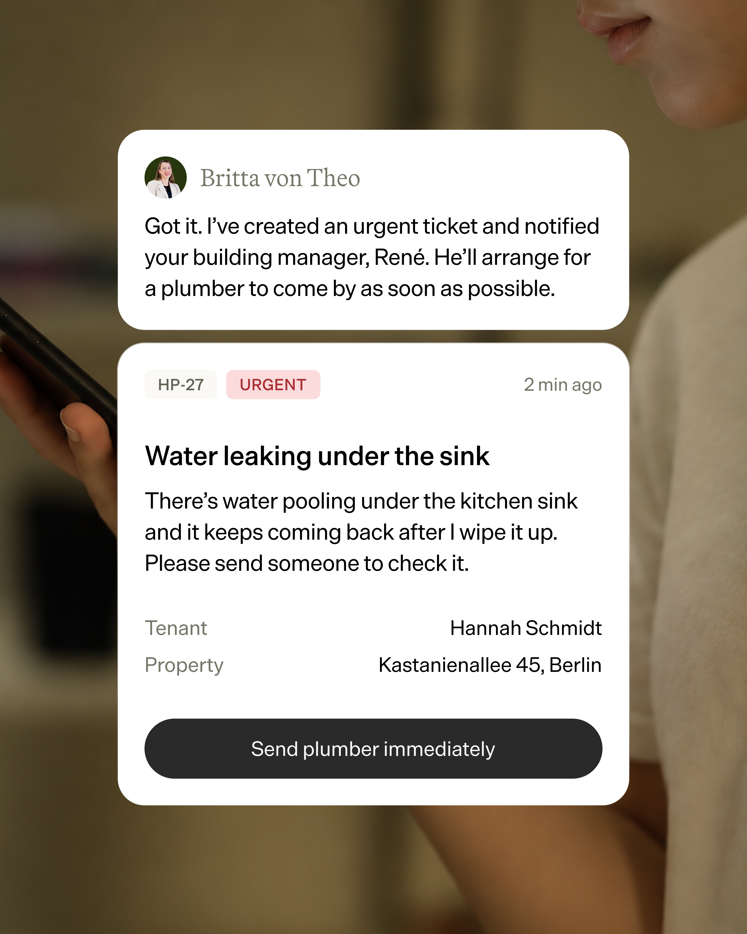
Property management app shows an urgent water leak ticket and a message confirming a plumber will be arranged as soon as possible.
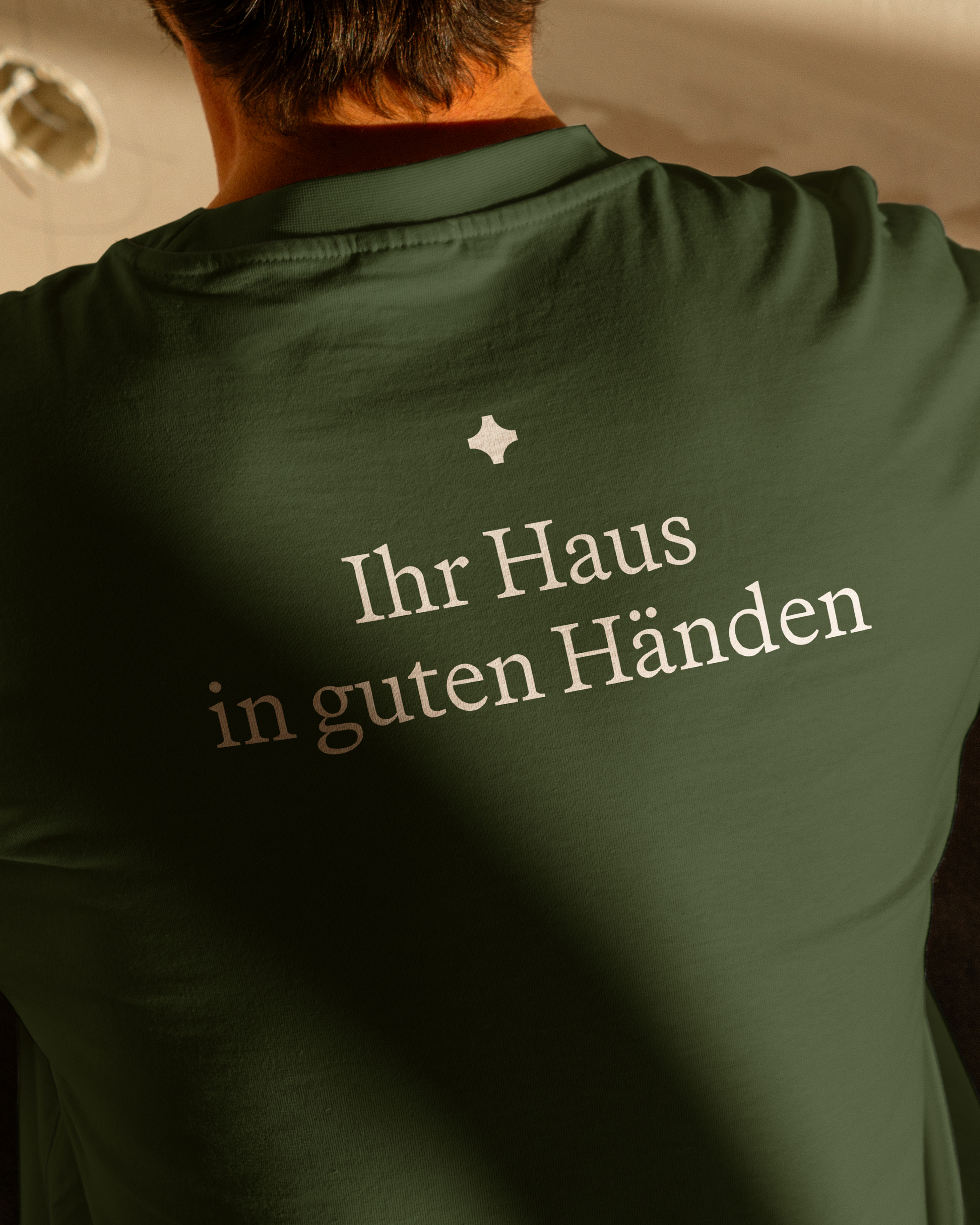
Close-up from behind of a person wearing a dark green shirt with white German text and a small white symbol.
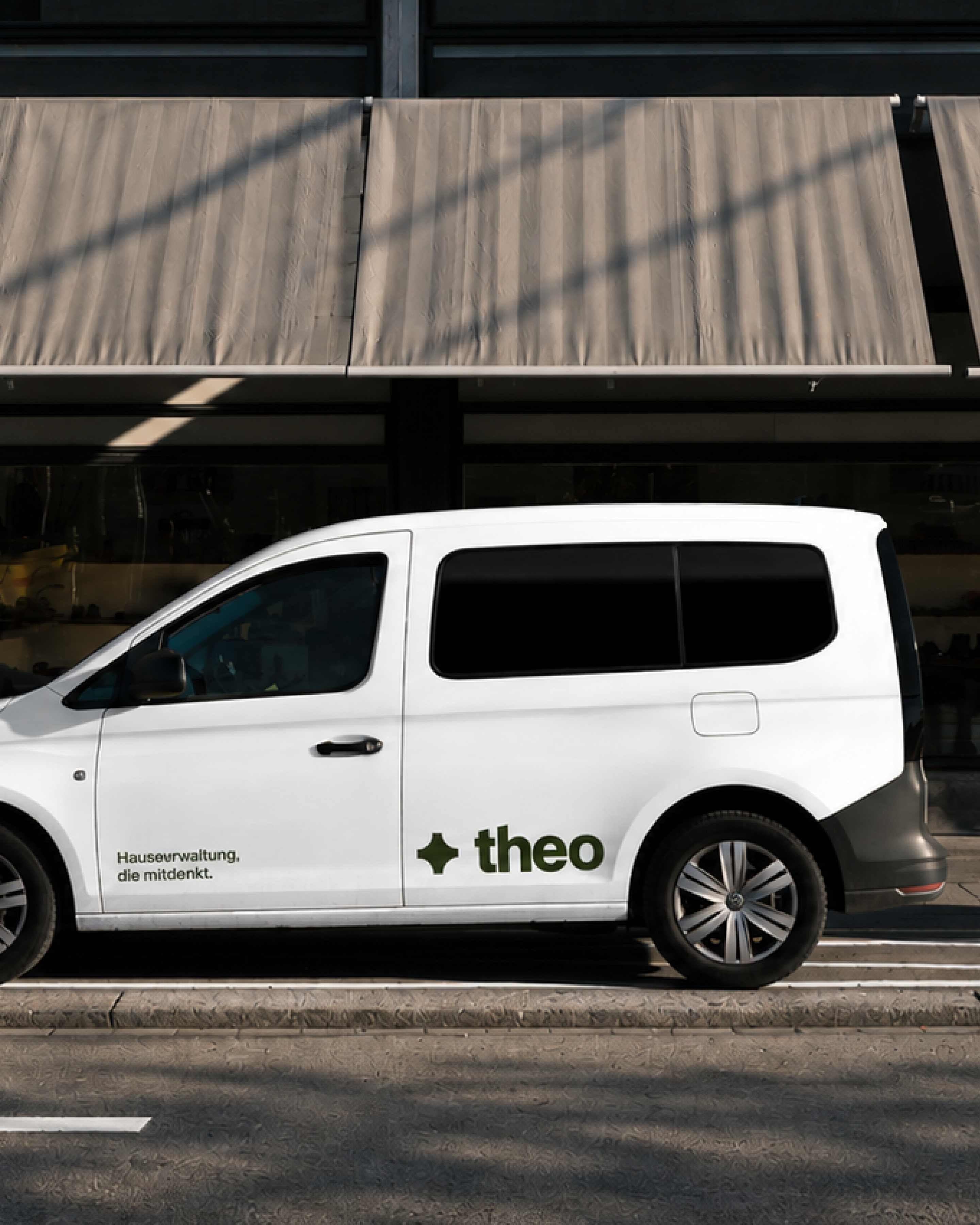
White Theo-branded utility van parked outside a modern building with fabric awnings.
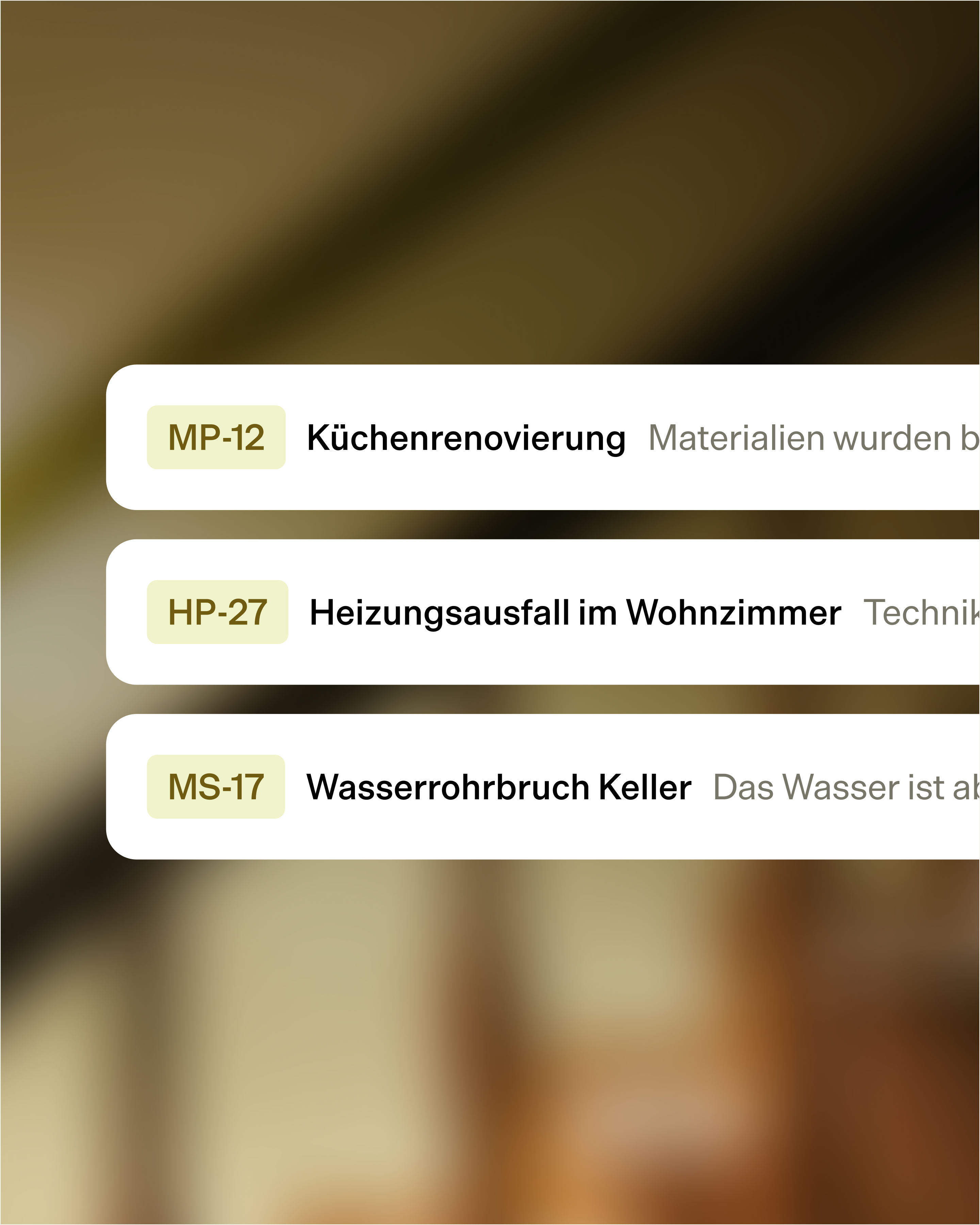
Three white task cards list MP-12 Küchenrenovierung, HP-27 Heizungsausfall im Wohnzimmer, and MS-17 Wasserrohrbruch Keller.
Theo – 7
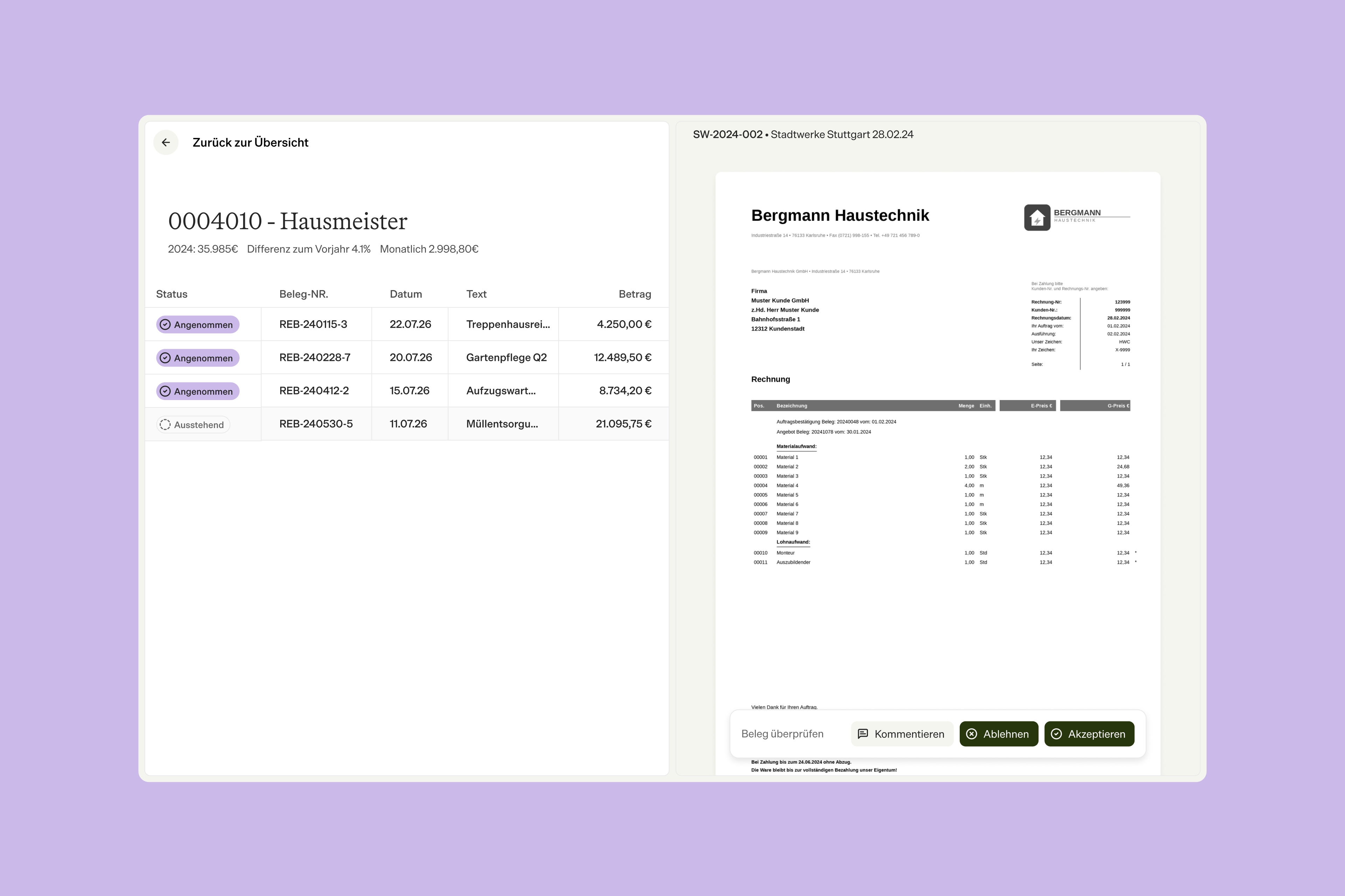
German invoice management dashboard showing a transaction list beside an invoice preview with comment, reject, and accept controls.
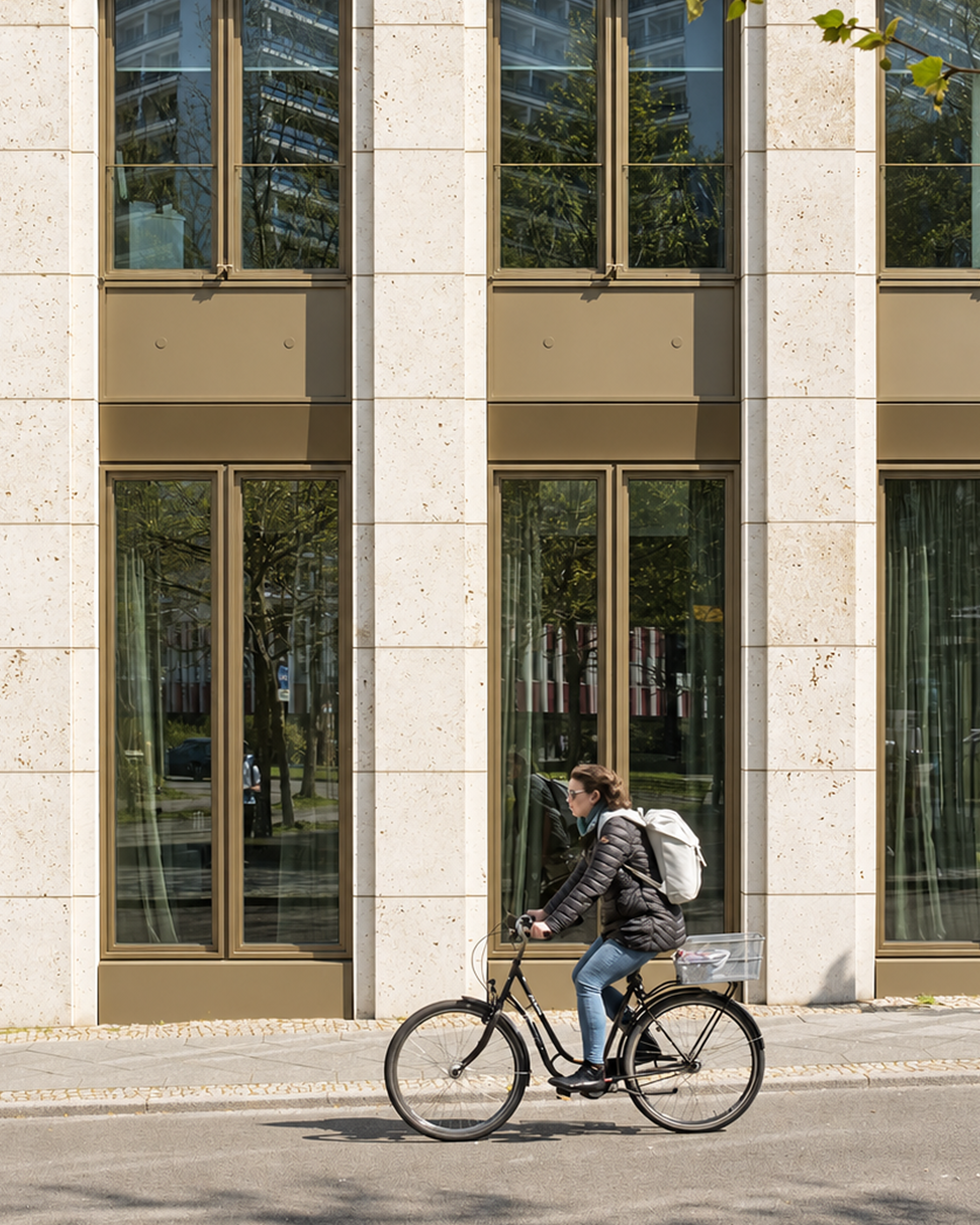
Woman with a white backpack rides a black bicycle past a sunlit stone building with tall reflective windows.
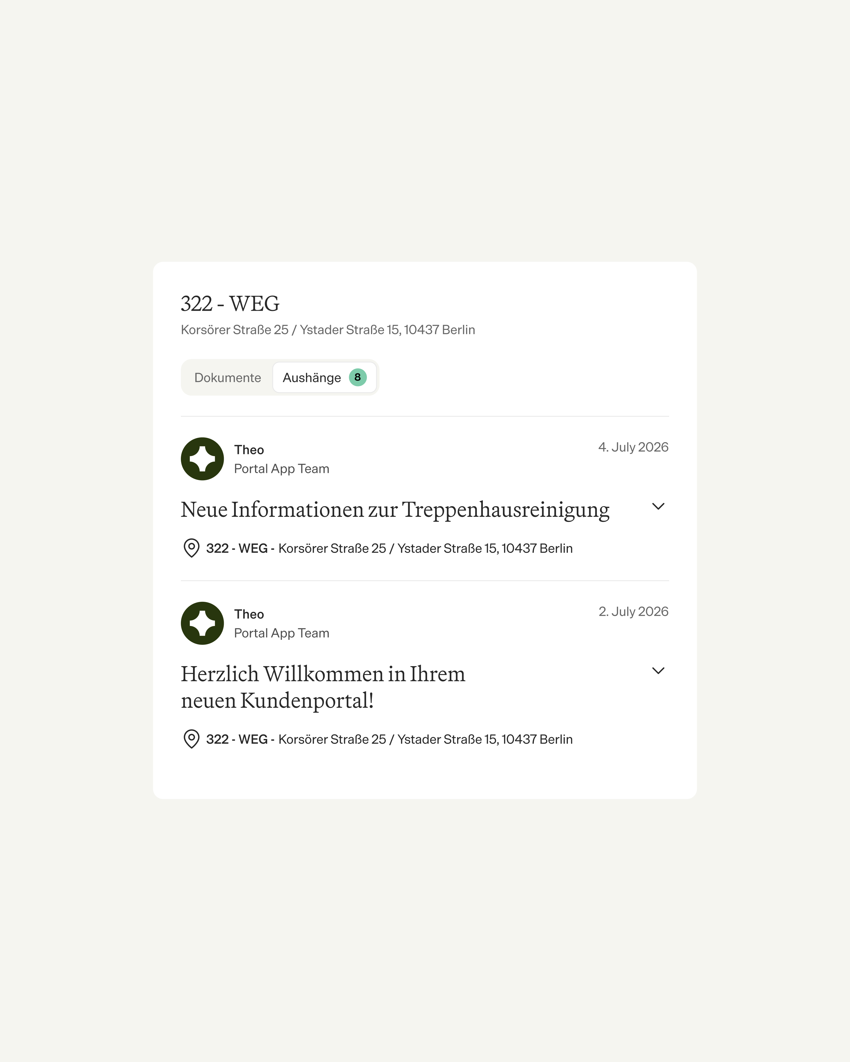
Property portal for 322-WEG in Berlin showing eight notices, including stairwell cleaning information and a customer portal welcome.
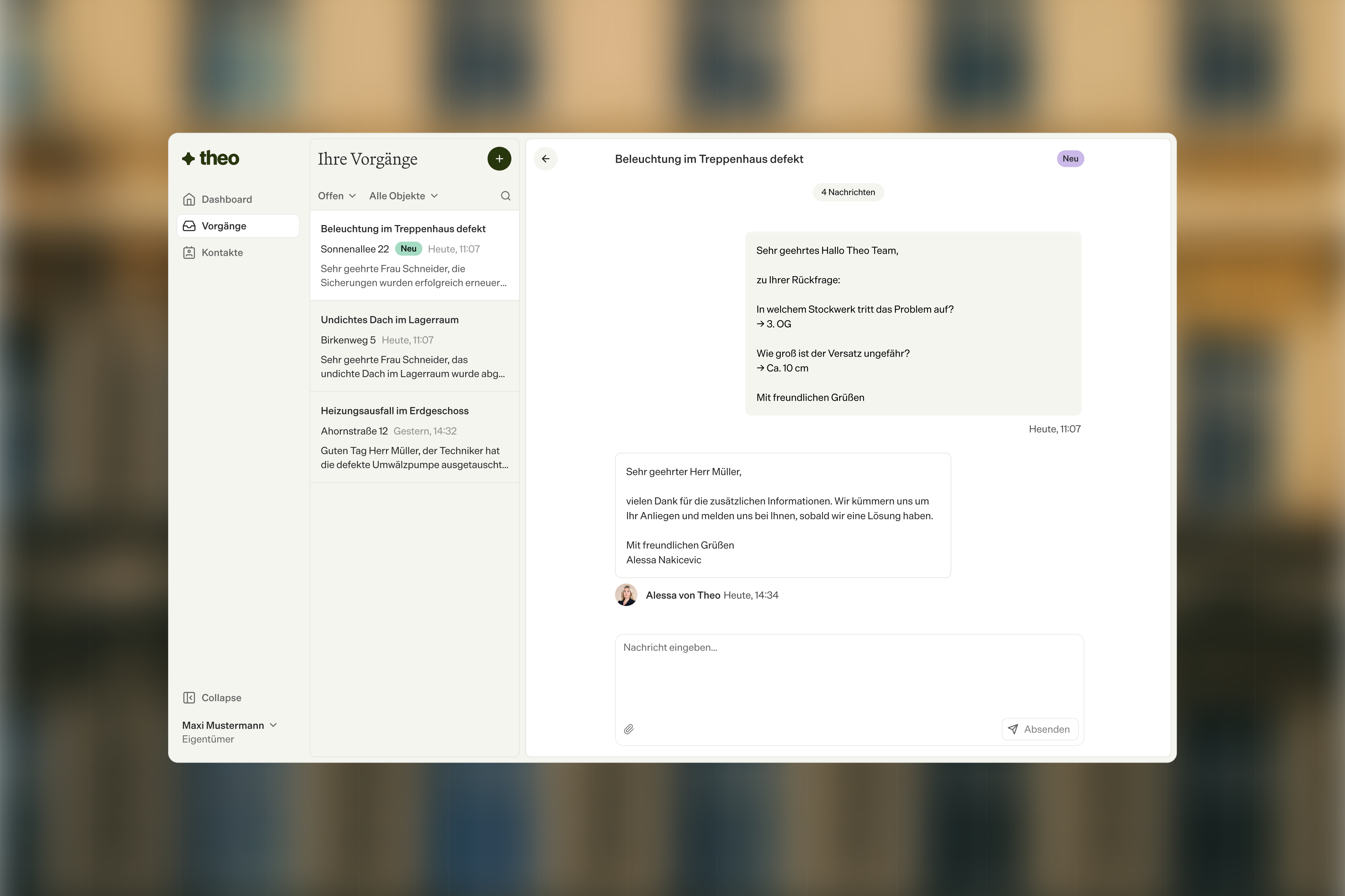
Theo property management interface showing case lists and a German chat about defective stairwell lighting.
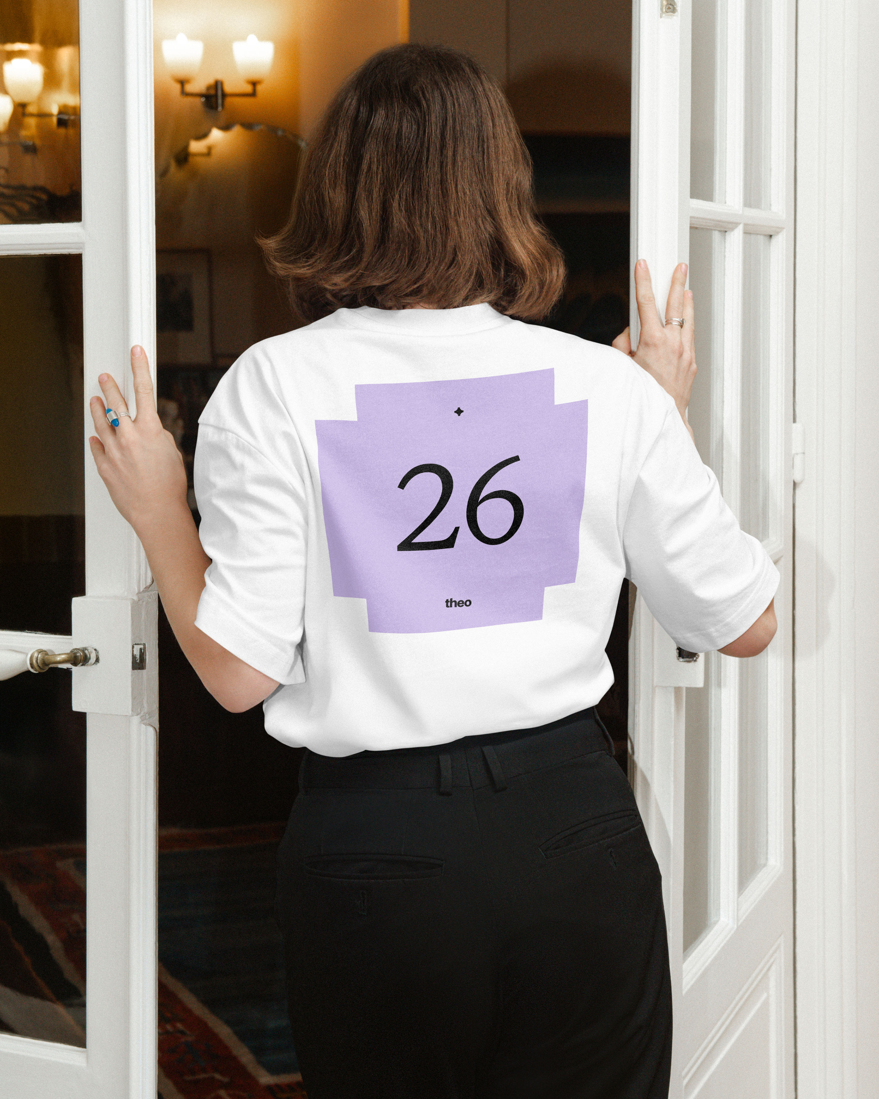
Rear view of a person entering a doorway in a white T-shirt with a purple graphic featuring the number 26 and the word theo.
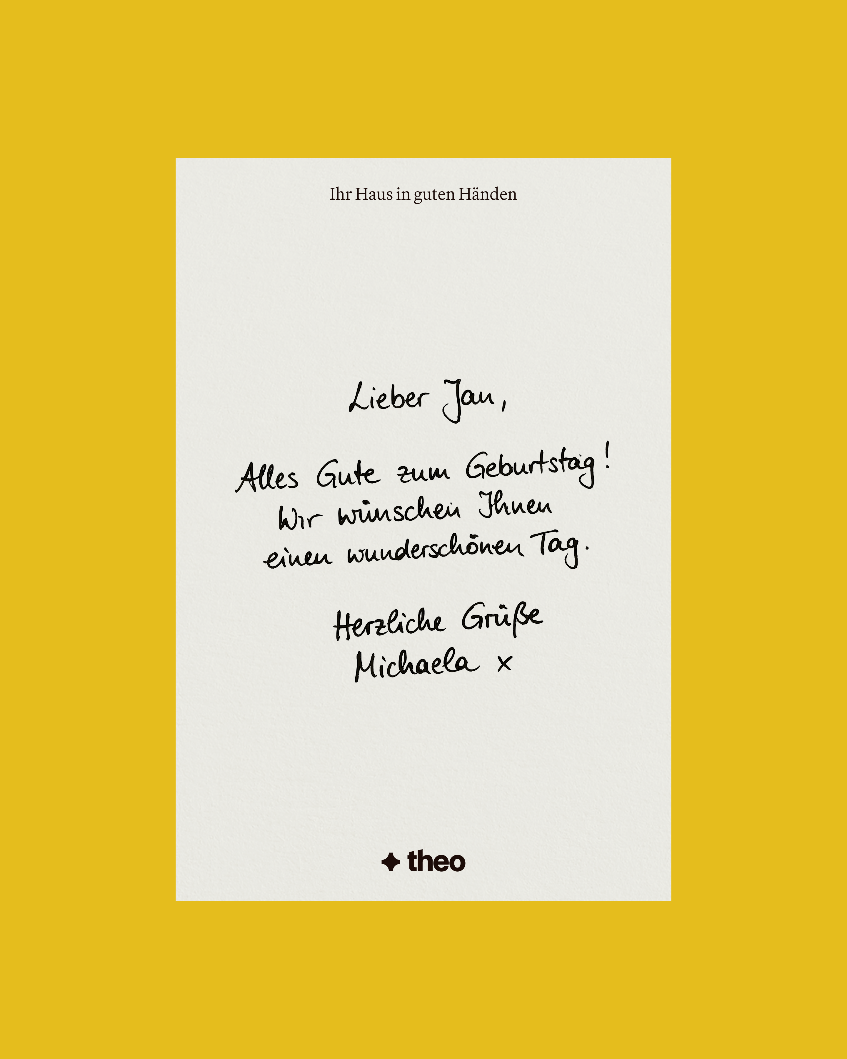
Handwritten German birthday message to Jan from Michaela on white stationery, framed by a mustard-yellow background with the Theo logo.
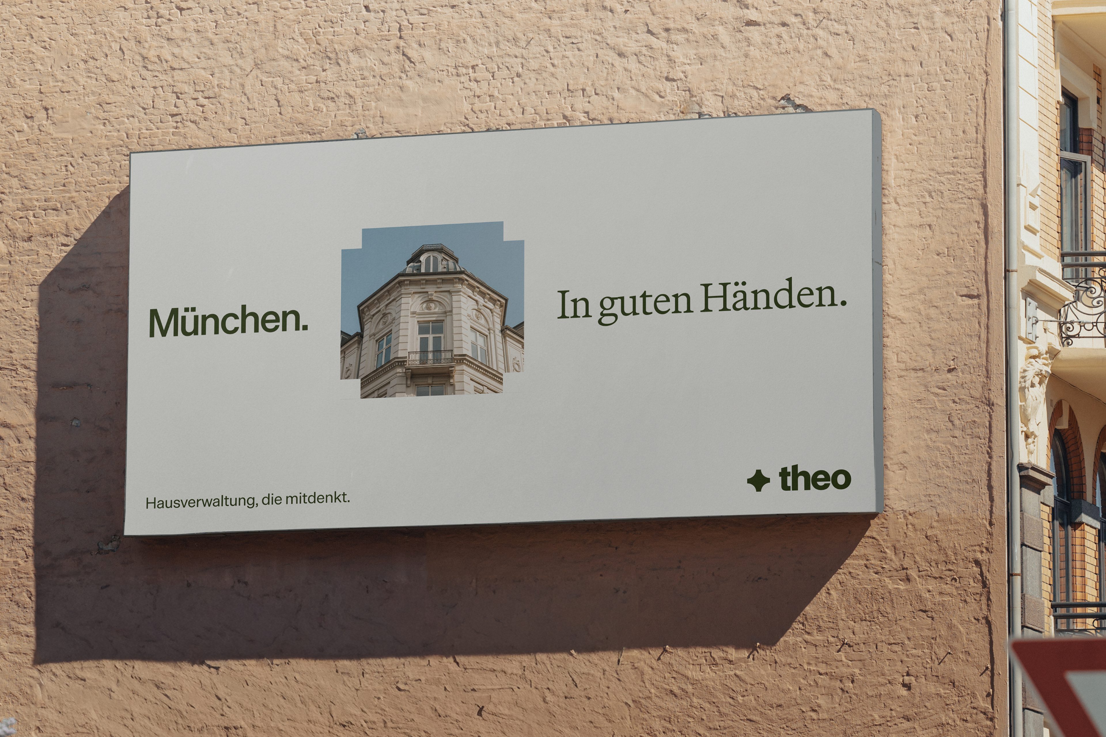
Large Theo billboard on a brick wall featuring a historic building and the German text “München. In guten Händen.”
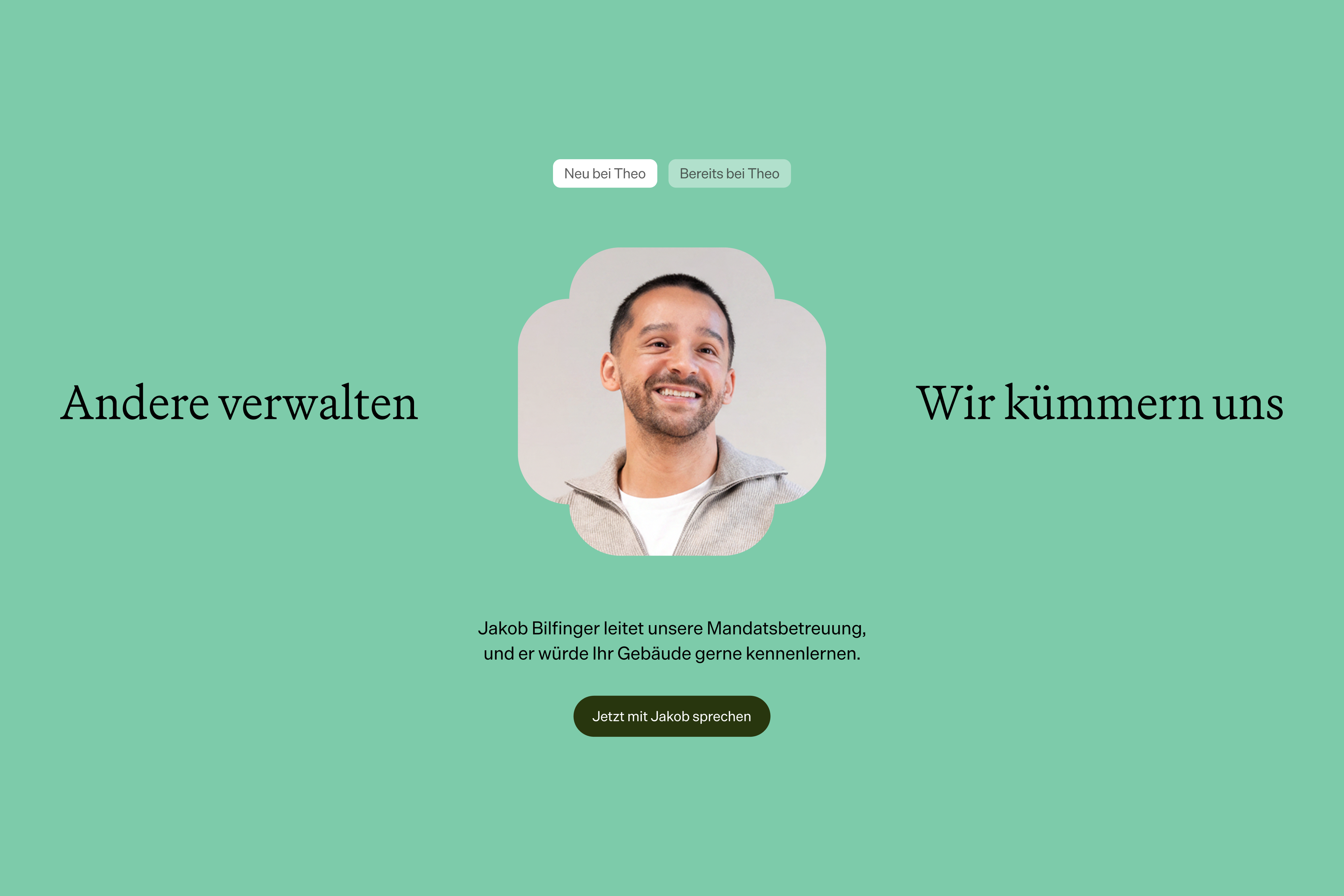
Contact page on a mint-green background featuring Jakob Bilfinger’s portrait, navigation options, and a button to speak with him.

The challenge was getting the balance right. Theo doesn’t want to do everything differently. It wants to do everything better. That distinction runs through the identity: modern without shouting about it.

Theo is AI-driven, but human-first. Property management lives and dies on trust, and that trust sits with the people on the ground, not the software behind them. Digital processes support their work, but never take the spotlight. The brand keeps the homes and the property managers front and center.

Brand Strategy, Visual Identity, Website, Product Design